

Buying a car, particularly when there are a lot of other options, is a little bit like dating – if the chemistry doesn’t feel right from the beginning, it’s probably not going to work out. But that can happen without you even seeing, much less speaking to, a potential customer.
In this installment of our Dealership Problem Solving Series, we’ll look at what can happen to ruin your online reputation without your knowledge or involvement.
 Mobile-first sounds like what it is – a way of designing sites from their mobile versions, up. This way, everything important on your site works perfectly on every size device. No confusion, no disruptions – just a truly seamless online experience.
All this thoughtful design means a site that is faster, more efficient, and scalable to any device size without sacrificing any functionality.
Mobile-first sounds like what it is – a way of designing sites from their mobile versions, up. This way, everything important on your site works perfectly on every size device. No confusion, no disruptions – just a truly seamless online experience.
All this thoughtful design means a site that is faster, more efficient, and scalable to any device size without sacrificing any functionality.
Dealership Website Problem: Cross-Device Confusion
A website that doesn’t do your dealership justice on every device isn’t just underperforming, it’s undermining your credibility. Creating an inconsistent impression is one of the most common online issues that dealerships run into. Here’s what we mean, played out through a customer’s eyes: Mark is looking for a new car. He’s pretty far into the process but stopped looking for a little bit because work got so busy. However, he just saw your dealership’s display ad while watching YouTube videos on his home computer and there’s a special that really interests him. So he clicks the ad and takes a look at the special, maybe perusing the vehicles available, and makes a note to stop by the dealership this weekend. Later, while chatting with a couple of friends, the topic comes up, and he tries to show them the awesome deal he found. But your mobile site doesn’t seem to have the same special he saw. Turns out, the special really is there, but not in the same spot or easily displayed as he saw on your full desktop version, and he’s not sure where to find it. After all, Mark’s trying to quickly pull up the information, not spend 10 minutes picking through a mobile site, so he gives up the search pretty quickly. His friends are sympathetic. “It was probably an expired ad. That happens all the time. But they don’t care as long as they get you in the door.” “Or maybe the deal already ended. Bummer either way.” They move on, but now Mark and his friends are familiar with your dealership’s name, and pretty unlikely to trust you or your messaging in the future. That’s a problem.How To Solve It:
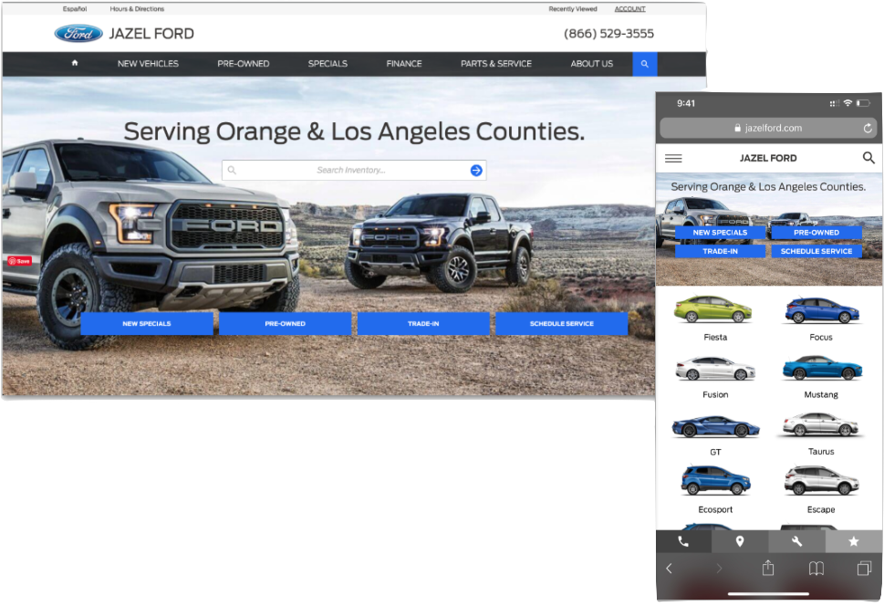
Clearly, your desktop and mobile sites can’t be identical, but they have to be immediately recognizable to and navigable by anyone who has come into contact with your dealership online before, regardless of device. That’s where mobile-first responsive design comes in. Responsive is essential. Every dealership site needs to be responsive. If yours isn’t, all your marketing alarms should be going off. Mobile-first takes responsive to the next level.Mobile-first sounds like what it is – a way of designing sites from their mobile versions, up. This way, everything important on your site works perfectly on every size device. No confusion, no disruptions – just a truly seamless online experience.
All this thoughtful design means a site that is faster, more efficient, and scalable to any device size without sacrificing any functionality.