
What is “Friction” in User Experience?
In user experience (UX), friction is anything that prevents a user from completing their goal. This is an incredibly simple definition, and yet, a surprisingly complex topic. Friction gets complex quickly because almost without exception, the goal is to remove it from your automotive website experience, and that can be tricky.
Unfortunately, friction is extremely easy to create and can be caused by any number of problems. The most common ways friction is created generally fall under one of the following categories:
- Too Many Distractions — Clutter creates friction. Simplicity is key to a smooth shopping experience on your automotive website.
- UI Inconsistency — Humans rely on familiar patterns. Designing too far outside these can cause friction.
- Uselessness — The addition of steps, actions, reactions, or decision points that aren’t necessary is one of the most prolific sources of poor UX on automotive websites.
- Confusing Functions — Nothing gets in the way of a good shopping experience like stumbling over unfamiliar tools.
Now, before we move on, we do have to make it clear that friction isn’t universally evil.
Not All Friction is Bad
We know this post is all about how to remove friction, but pump the brakes (and don’t worry that doing so increases friction). Sometimes friction isn’t a bad thing. It feels like there are 10,001 articles out there about how friction on websites will murder your CX, but we feel that’s a bit close-minded and simplistic. The whole picture is a bit more complex but worth mentioning (very quickly).
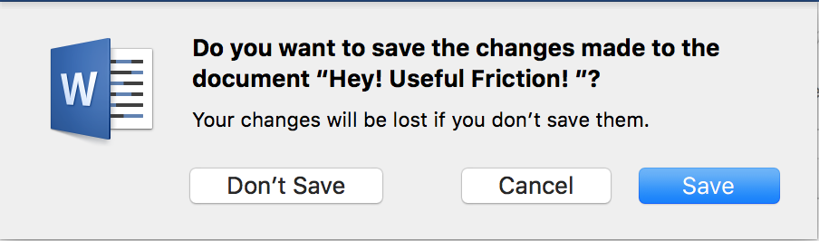
Friction is sometimes necessary. Confirmation prompts, for example, are a step that 100% adds friction. Technically unnecessary, this steps counts as friction. Confirmation prompts have saved us from hair-tearing stress time and time again.
Now that we’ve covered the exceptions, let’s return to enforcing the rule. Non-essential friction turns what could have been an excellent shopping experience on your automotive website into a lost sale (and likely a happy competitor). We’d like to prevent that as much as possible, so without further delay, let’s launch into some of the best ways to remove friction from your dealership website.
UI Patterns
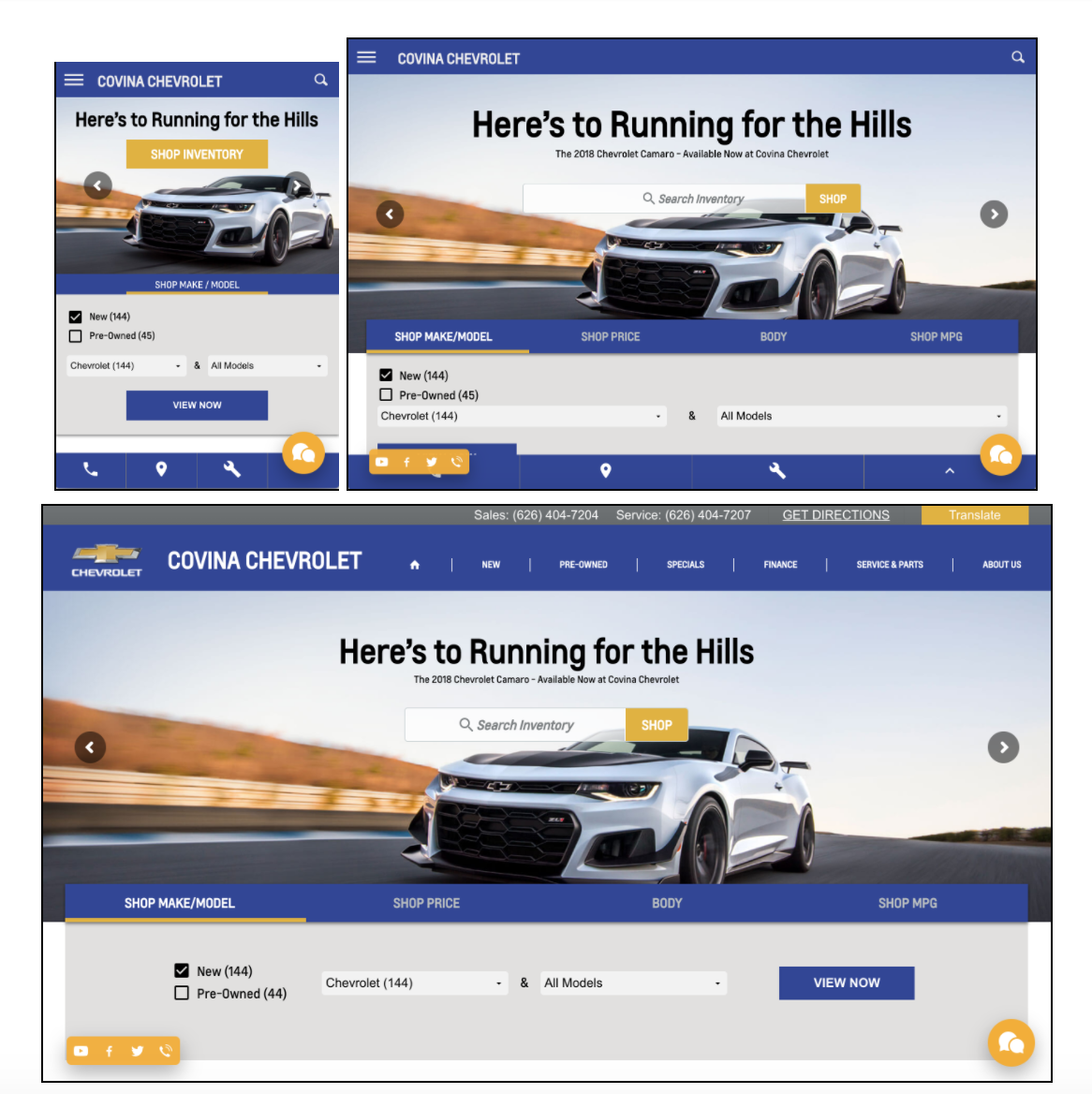
The human brain is exceptionally well programmed for pattern recognition. Familiar patterns become so well-ingrained in our minds that they literally become second nature. The internet has been around long enough that users have become familiar with the patterns and processes for website use and navigation as displayed on the user interface. Frictionless website design is built to match these common UI patterns as closely as possible to facilitate easy browsing on your automotive website while still being refreshing and uniquely interesting.
These UI patterns sometimes aren’t easily noticeable until the pattern is disrupted. For example, these days, we recognize that the “three stacked bold lines” symbol on your automotive website means “menu,” and that if we click it, we will see a list of the pages available on the site.

This is a pretty universal symbol online at this point. But imagine being one of the first to see it. Without any evidence as to what that symbol indicates, the potential for confusion is tremendous. Is it a messed-up equals sign? Is it where I can place my Wendy’s order? Not for nothing, the official name for this symbol is a “hamburger button.” Nowadays, we can happily use hamburger buttons as menu indicators on your automotive website and ignore the culinary terminology. But still, there’s a lesson here: UI patterns exist for a reason. Unless you have a very good reason for being unique, it’s best to prioritize user experience over fanciful formatting on your automotive website.
Consumer Expectations
These days, web experiences are being optimized so quickly that friction seems less tolerated by the minute. And why should it be? Frictionless design is all about removing inconvenience, taking away barriers to goals, and streamlining the user experience.
The customer-centric design and tools that dominate online retail, are setting shopper standards for all types of transactions, including automotive ones, and when shoppers reach an automotive website that doesn’t meet their expectations, they encounter friction.
Shoppers expect personalization, prediction, and adaptation from their online experiences, and they expect to be able to achieve their goals from anywhere and anytime. There are many areas to focus on when removing friction from your automotive website, but not living up to shoppers expectations is a major source of friction that is dangerously easy to miss.
Want to know more about this? Check out our guide to Car Marketing in the Age of Digital Retail.
Chunking
Though it is possibly one of the least appealingly named design principles, chunking is actually quite attractive to look at. Before we subject you to further uses of the term “chunking,” let’s look at a few examples.

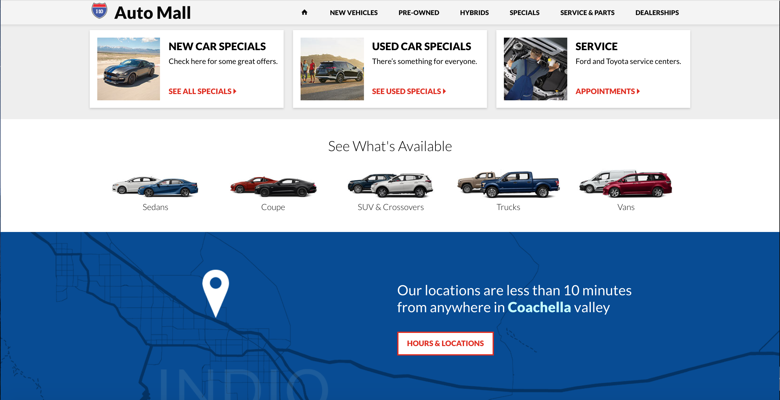
This particular principle of automotive website design seeks to break information up into visually distinct sections. These separate, thematically-appropriate website chunks reduce friction by essentially making it that much easier to find and understand information online. By breaking information out into easily distinguishable sections, keeping that section singularly related to one specific topic, and supporting those distinctions with design choices, “chunking” actually helps users have a faster, smoother, and more delightful experience on your automotive website. Here’s the anatomy of a ‘chunk’:
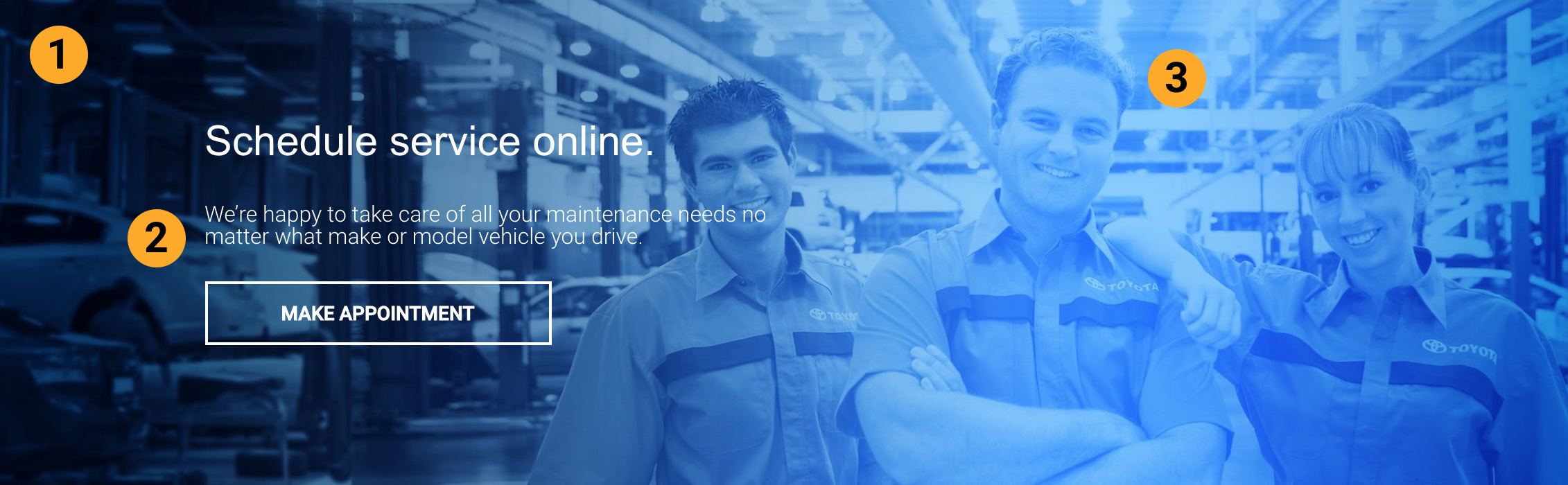
2. Single message: The only information in this section is about Service. As it should be.
3. Uniform design: The subtle background image also denotes this section is about service.
The point of chunking is to help the shopper evaluate information faster, using a variety of visual and spatial cues. In our example above, a quick glance is all it takes to understand the essence of the section, and on a dealership website, that’s all a shopper needs.
Chunking reduces friction on your automotive website by saving the shopper time and energy hunting for the right section or information. As horrible as its name is, this design technique is one we would recommend for all dealerships looking to improve their user experience.
Limited Steps to the Goal
One of the centrally important tasks in designing for exceptional user experience is limiting the amount of time and energy a user spends trying to achieve their goal on your automotive website. The fewer steps, tasks, actions, or reactions a user must go through, the less friction they experience.
Let’s break this down briefly.
Scenario: I’m looking for a silver Camry with heated seats.
On one site:
Click Camry models on homepage
[Wait for SRP to load]
Click Features filter
Select “heated seats”
Click Color filter
Select “silver”
[View results!]
On a site with less-friction:
Enter “silver Camry heated seats” into search bar.
[Wait for SRP to load.]
[View results!]
That’s a process that takes a minimum of 5 actions on one automotive website being cut down to just one quick, intuitive step. This is a useful tactic for demonstrating the impact that friction can have on user experience, but it’s also a great way to evaluate your own site. See how few (or how many) steps it takes to perform basic online shopping actions. The results can point out areas that need some work removing unnecessary steps that cause friction.
Navigation
Navigation isn’t always the aspect of web design most prone to friction, but friction encountered during navigation can be even more fatal to user experience, simply because of how important it is to be able to navigate properly on your automotive website.
Reducing friction in your automotive website navigation centers around having a solid information architecture following an intuitive hierarchy. This helps ensure that your website is organized in a way that naturally makes sense to the average shopper. Once this primary requirement is satisfied, you can focus on making the design of your navigation intuitive and clear. Common UI patterns like top navigation and standardized menu indicators are ideal options for making sure your customers know where and how to move around your automotive website.

Another way to reduce friction in your navigation is to keep navigation consistent across your web pages and ensure that the navigation you are making available is representative of your dealership’s situation. This is particularly important for dealerships that are part of a dealer group, or have a unique situation they should highlight in their navigation.

Clean and Attractive (but Exciting) Design
Friction is caused by unnecessary elements — both functional and purely aesthetic. The powerful and comprehensive shopping tools you want to offer your customers won’t be effective without a clean and frictionless design.
Mobile-first design is the hero of this particular section. When a web page is designed mobile-first, it means that it is built starting with the mobile experience, then scaled up as it is built to deliver an experience that is always phenomenal and optimized perfectly for whatever device a shopper happens to be using. Mobile-first is the best way to build truly responsive automotive websites, but the real beauty of mobile first is the friction immediately removed or reduced by its implementation. Because mobile-first design works by adding carefully evaluating and adding only the effective and necessary tools at each device size, the potential for friction caused by cluttered design or a bloated site is significantly lower right off the bat.
UX design should prioritize use, and limit over-stimulation. There is a principle in psychology that has been particularly important for design, called the Paradox of Choice. Without diving in too deep, this principle posits that consumers experience heightened anxiety and less satisfaction with choices when presented with too many options. Keep automotive website clutter to a minimum, and you’ll create less friction for your shoppers.
Friction is removed by removing elements, but there is such a thing as overdoing it. Think of it like pruning. The more of a tree you prune, the more fruit you get — up to a point. Stop when you (or your resident automotive website expert) think you’ve reached that point. You don’t want to end up with a stump.
Now, design should be highly pruned and professional, but that’s only part of reducing friction. There’s actually something you can add to your automotive website to ease friction: positive emotion.
As Don Norman, esteemed cognitive scientist and author of ‘The Design of Everyday Things’ points out, negative emotions can make it hard just to do simple and easy tasks, but positive emotion can make it easier to take on and complete difficult tasks. In fact, one study found that among shoppers comparing six hypothetical cars, those with positive emotions induced in them before making a decision were significantly more efficient in their task processing.
That’s right. Engaging, delightful design that makes your customers happy actually helps them when it comes to making their vehicle buying decision.
Content
We know that bringing up content in a discussion about design might seems a little off-topic, but really, the point is to give you all the tools possible to reduce friction on your automotive website, and content can be a source of friction.
Content doesn’t just mean the efforts of your content marketing — we mean all the content on your website. Vehicle descriptions, homepage copy, SRP vehicle snapshots, About Us, Hours and Directions, and on, should all be useful, informative, or engaging. Poor content, or content that isn’t actionable, is a stumbling block on the shopper journey — and one that most likely won’t be forgotten.
At all times, try to prioritize consumer information-finding. Only add content to your website, in any form, if it is demonstrably useful to your shoppers. We mention this many times, but we believe automotive websites, and in general, dealerships themselves should take the position of being a decision-making assistant.
In general, friction is best eliminated by aligning your automotive website goals with the goals of your shoppers. Content is a major part of that.